Navigation
Masthead
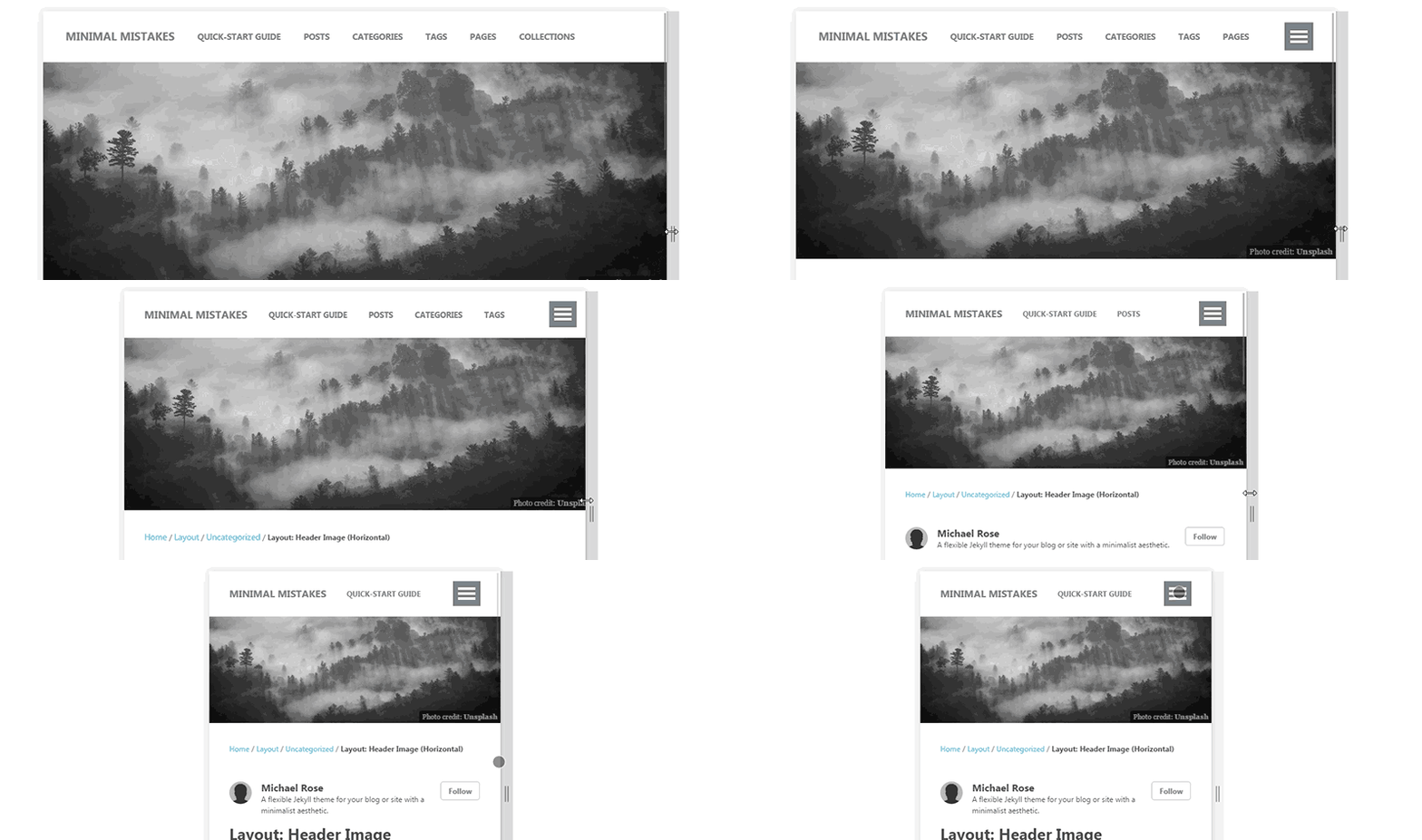
The masthead links use a “priority plus” design pattern. Meaning, show as many navigation items that will fit horizontally with a toggle to reveal the rest.
To define these links add titles and URLs under the main key in _data/navigation.yml:
main:
  - title: "Quick-Start Guide"
    url: /docs/quick-start-guide/
  - title: "Posts"
    url: /year-archive/
  - title: "Categories"
    url: /categories/
  - title: "Tags"
    url: /tags/
  - title: "Pages"
    url: /page-archive/
  - title: "Collections"
    url: /collection-archive/
  - title: "External Link"
    url: https://google.com
Which will give you a responsive masthead similar to this:

ProTip: Put the most important links first so they’re always visible and not hidden behind the menu toggle.
Breadcrumbs (Beta)
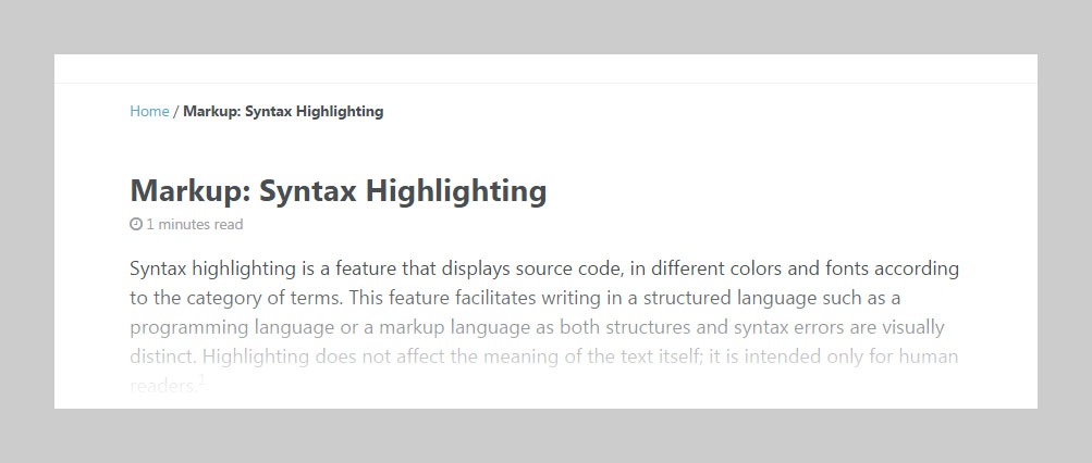
Enable breadcrumb links to help visitors better navigate deep sites. Because of the fragile method of implementing them they don’t always produce accurate links reliably. For best results:
- Use a category based permalink structure e.g.
permalink: /:categories/:title/ - Manually create pages for each category or use a plugin like jekyll-archives to auto-generate them. If these pages don’t exist breadcrumb links to them will be broken.

breadcrumbs: true # disabled by default
Breadcrumb start link text and separator character can both be changed in _data/ui-text.yml.
breadcrumb_home_label : "Home"
breadcrumb_separator  : "/"
For breadcrumbs that resemble something like Start > Blog > My Awesome Post you’d apply these settings:
breadcrumb_home_label : "Start"
breadcrumb_separator  : ">"
Custom Sidebar Navigation Menu
See the sidebars documentation for information on setting up a custom navigation menu.